Channel Islands Television
Channel Islands 1964 - 2002
Introduction
Once the ITV system had got up and running throughout the UK, there was a small group who felt isolated and ignored. These were the inhabitants of the Channel Islands. Why, they demanded to know, can't we have commercial television as well?
It was pointed out to them (with equal parts tact and exasperation) that as the Islands were not part of the UK under law but Crown Dependencies, they were not covered by the various Acts of Parliament which had brought ITV into being. And so the Islands' delegation was sent back across the sea empty-handed.
And that would have been the end of it, had not the Postmaster-General and the ITA shot themselves in the foot by announcing that, from early 1965, Independent Television (in the form of Border) would begin transmitting on the Isle Of Man.
This set bells ringing in St. Helier and, before you could say "tax haven", another delegation of worthies had formed and headed off to London to press their case.
After a certain amount of obfuscation, lawyerising and general Sir-Humphreying, it was finally conceded that the Channel Islands could not only have ITV, but their very own franchise.
And so, with money being slightly less of a problem than it would have been for a service area of similar size on the mainland, Channel Islands Television began broadcasting on 1st September 1964 from a studio in St. Helier and a transmitter at Fremont Point on Jersey.
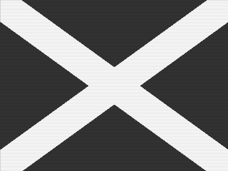
| The company's first ident began with white bars moving in from each corner... | 
|
|
...to form a saltire. This represented the flag of Jersey. |
| Then more white bars appeared from the four sides... | 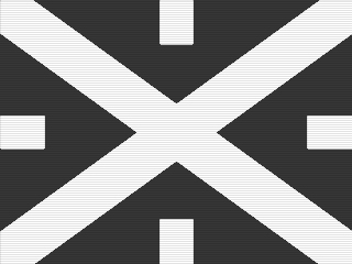
|
|
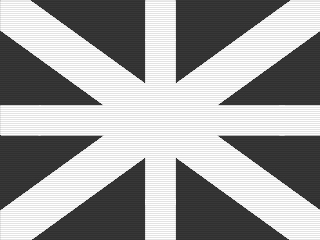
...to form a cross. This not only represented Guernsey's flag but, combined with the saltire, formed a somewhat stylised Union Flag. This was possibly the company's way of making a point in the light of the difficulties they had faced from London. |
| In the centre of the 'flag' there now appeared a dark ring... | 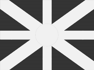
|

|
...into which the bars retreated... |
| ...to leave a white circle. | 
|
|
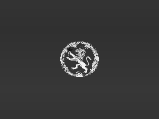
Upon the circle then appeared an heraldic device. This was the coat of arms of the island of Alderney, a lion holding a leafy twig (or, as its detractors called it, "a pussy with a pansy"). |
| The form-up was completed by the company's name and the channel number of the transmitter. All this was accompanied by a fanfare which seemed to be somewhere between mediaeval France and "The Dambusters' March". | 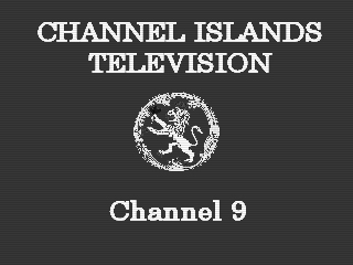 |
In truth, the ident didn't go over too well with the inhabitants of Alderney. Because of the Heath-Robinsonesque way in which network signals had to get to the Islands, Fremont Point could only transmit at very low power in the direction of the third island, which meant that only those with very good aerials on the southwestern corner of Alderney could get a picture much of the time. In the light of all this, putting their arms on the company's ident was, they felt, taking the piss.
The inhabitants of the fourth largest island were, on the other hand, a bit miffed that their symbol (two golden lions) didn't feature at all. In fact, they got quite Sarky about it. But it was pointed out to them (not least by people from Alderney) that at least they could get a picture without resorting to space-age ironmongery.
|
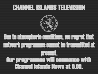
Not that the full service area escaped problems, especially in the early days. Propagation conditions could sometimes render the signal from England unusable, in which case, the only answer was to apologise nicely and play some soothing music. |
| Locally-produced programming (almost entirely news) was endcapped by this minor adaptation of the main ident. | 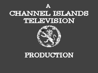 |
|
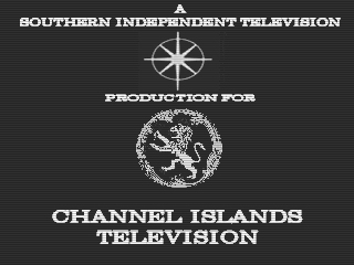
However, such were the difficulties of running a small company in a tiny advertising market with little technical experience, that many programmes had to be provided with the generous help of the nearest two mainland providers, Southern and Westward. As a reward, each of these companies got their own production endcaps. This was Southern's star turn... |
| ...and here's The Golden Hind in all its monochrome glory. | 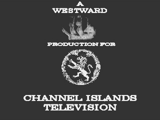
|
|
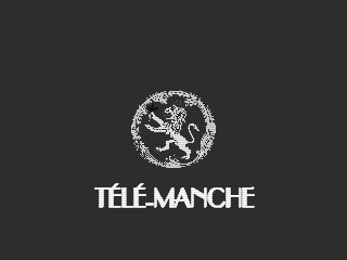
There were still some speakers of a dialect of Norman French [Who he? - Ed.] in the Islands, and so a weekly ten minute news programme was transmitted for them on Sunday lunchtimes. For a while, this rather fetchingly Gallic variant of the ident was used as a frontcap, but it soon fell into disfavour. Alors! |
Channel Islands Television had retained its franchise without a fight in the next round of bidding, but had been asked by the ITA to try to make more of its own programming. This was going to be a bit tricky, but Southern and Westward both helped out by carrying on making quite a few programmes on CITV's behalf without their names appearing on them, so that it looked as if the little fellows were doing it all themselves.
| With the new contract in the bag, CITV decided to completely revamp their ident. Now it started with an outline map of the four main islands... | 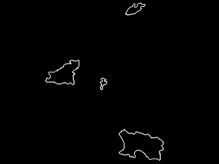
|
|
...which morphed cleverly... |
| ...into a pattern of four stars (or is it a stylised flower?) in the centre of the screen... | 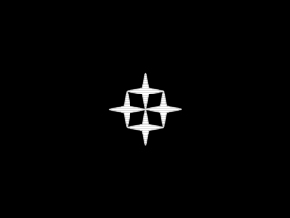
|
|
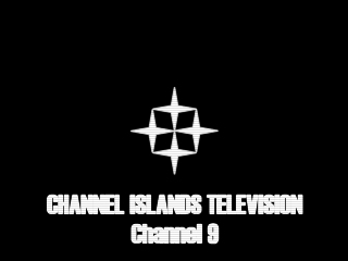
...finishing with the station and channel information. A more concise, punchier fanfare was now being used. |
| The production slide was an obvious adaptation of the basic form. | 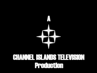 |
This very basic but very strong new image was a huge asset to CITV in the coming years, especially as it had to deal with the fact that, due to huge technical difficulties, it would be very late in getting all this new-fangled colour television nonsense which was starting up from Lerwick to the Lizard.
With all the practical obstacles finally cleared, colour television (on all three channels) finally reached the Channel Islands in the mid-summer of 1976.
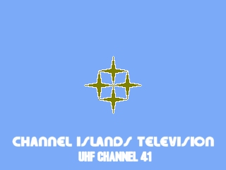
|
Channel Islands TV decided to keep it simple for their first colour ident. Out of a light blue field, the four stars faded in. Except that now they were a sort of bronze colour. Then the station's name appeared in a snazzy font, followed by the channel number of the new UHF transmitter at Fremont Point... |
| ...but it didn't end there. Just to make the point, the words "IN COLOUR" (in colour, natch) appeared at the top of the screen. An extra sting was attached to the end of the existing fanfare, just for continiuity's sake. | 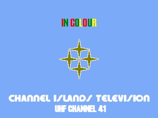
|
|
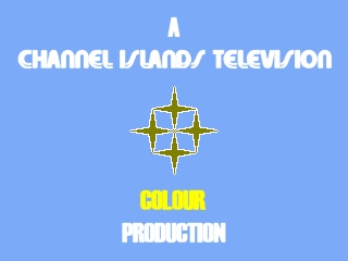
The production slide wasn't much more complicated than that, either. |
| Three years on, and they decided to become a little more adventurous. On to a background of a somewhat darker blue than before... | 
|

|
...was wiped a white stripe. |
| In the centre, there were those stars/that flower once more. | 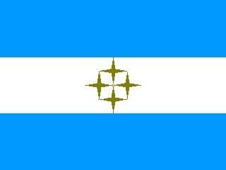
|
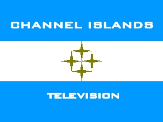
|
Followed by the station's name. |
| And here's the production endcap. | 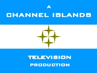
|
By the time 1982 dawned, CITV had retained their franchise yet again (although it wasn't as if there was any more competition for it than previously). With this new mandate, renewed confidence and more money, the company decided that it was time to shed the rather simple and unprepossessing idents they had been stuck with since the introduction of colour five and a half years before, and become quite radical.

|
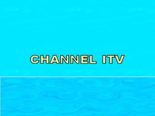
The Channel Islands were, they reasoned, between the sea and the sky. So how better to start their new ident than with these two elements... |
| ...and then, suddenly emerging from the ripples...no, not Venus on a shell, but the top half of the company's (now abbreviated) name. So long as it didn't mean "Go stick your head in a pig" in the local language, what did it matter? | 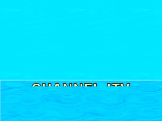
|
|
Now the name could be seen clearly as it climbed towards the wispy clouds... |
| ...when all at once the sky turned black. A bad omen? Had Michael Green turned up to lay his curse upon ITV a decade early? | 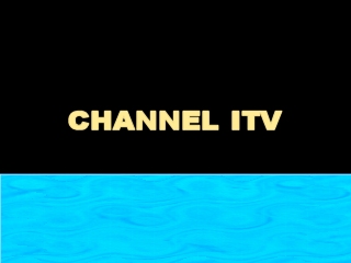
|
|
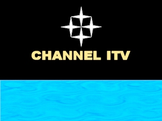
No, it was night-time. So it was time for the familiar old stars to come out again. Electronic music voomed and twinkled while all this was going on. |
| Of course, this all meant that there wasn't much fevered imagination left over for the production slide, but they didn't do too badly. | 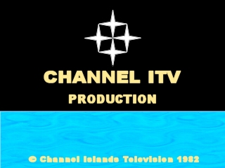
|
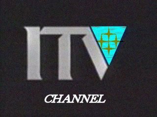
The 1982 idents were far enough ahead of the game for them to survive unchanged for seven years, but it was probably just as well that the famous ITV 1989 generic ident came along when it did. If nothing else, it saved the company having to think of (and pay for) a complete new set of their own.
|
It had to be said that, although a certain amount of manipulation of CITV's familiar symbols had to take place, they did look rather good in the tempting triangle. Notice also how, at least for the time being, the station's name was now down to just one word. |
It was becoming apparent by early 1994 that the generic ident could not be used for much longer, as even Grampian had started to lose interest in it by that time. What with that and the impending 30th anniversary of the company coming on air, it was clearly time for change once again. And so...
| Is it the sea? Is it the sky? | 
|

|
No! It's...Super.....imposed Company Name! Note that the company has changed it's on-screen name to "Channel TV" now. |
| This manages to tread the thin line between boasting and obsequiousness...but only just. | 
|

|
And it just wouldn't be the same without those stars (or that flower), now, would it? |
| Once the festivities had passed, they just wiped the slogan and carried on regardless, although the ITV logo seemed to be merely an optional extra : sometimes it wasn't there... | 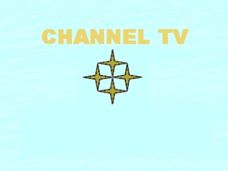
|

|
...and then it was back again... |
| ...and the production slide even had a slightly different way of displaying it. | 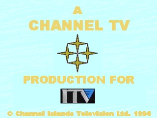
|
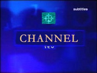
These idents lasted until 1999, until the latest outbreak of Genericitis.
|
Although the company's symbol (again somewhat faffed-about-with) looked OK in its little box, it was clear that identity was one thing the ITV Network had no time for anymore. |