
Heartland Television
Central England 1982 - 2002
Introduction
The franchise round which was to take effect from January 1st 1982 brought some major surprises: it was to be the last twinkle, twinkle of the little star for solid, staid, kids-friendly Southern; and the Golden Hind was scuppered with all hands in Plymouth Sound. But by far and away the biggest shock was the axing of ATV. ATV, one of the original contractors and certainly the best known worldwide of all ITV franchise holders: but that was the problem. Concentrating on its international profile had, in the view of the Brompton Road College Of Cardinals, led the company to neglect its pastoral duties to the people of the Midlands. And so it was that as 1982 opened, ITV was de-Graded and the legendary eye closed for ever.
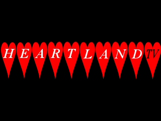
| Shortly before 9.30 on New Year's Day 1982, the TV screens of the people of the Midlands (or, at least, those in any fit state to take notice) went black. Was this an omen? No! It was the beginning of the New Era, as a red heart appeared on the far left of the picture... |  |

|
...followed by another one... |
| ...and so on right across the screen. | 
|

|
But
where do we go from here? Ah! Gimme an "H"! |
| Gimme an 'E'! | 
|

|
And
so on across the screen again until the new company's name is spelled
out for all to see.
But wait a mo! There are only nine letters in "Heartland" and there are ten hearts. |
| Aargh! What's this? | 
|
|
Oh, I see...Just in case we thought we were watching the radio... |
The whole sequence was accompanied by a jingle which was even more retro than the ident: a rising scale of woodwind and brass, complete with a final "ting!" when the flash went off which was for all the world like the "ting!" which used to end the original Tyne Tees ident twenty-odd years before.
| Here's the production slide... | 
|
The new company was slow to find favour with a public which had been used to the same style for a quarter of a century. The ident was not widely admired, either, being perceived as singularly lacking in imagination ("ting!" notwithstanding), and not what was needed in the thrusting, go-ahead 1980s.

|
So, just over a year after going on air for the first time, the station's ident saw a revamp. Again, it started with a single red heart, but this time in the centre of the screen... |
| The second heart duly appeared, but at a right-angle to the first... | 
|

|
...and then another... |
| ...until the pattern was completed... | 
|

|
...except for the company's name, which faded in at the bottom. |
One of the main selling points for Heartland in its franchise application was its promise to enhance the ITV service in the Midlands by creating two 'sub-regions' based around small satellite studios in Oxford and Nottingham in addition to the main complex on the outskirts of Birmingham. However, there was a dispute with the technicians' unions which meant that it was November 1983 before this plan could be put into operation.
When it was, it meant that the sub-regions' output (consisting almost entirely of local news bulletins) needed a clear branding. So a new set of idents was devised to introduce the sub-regional variations of the company's flagship evening news "Heartland Today".
|
The four hearts formed up as before, but then
rotated about the vertical axis, re-appearing with the heart
representing the sub-region (the west, in this case) now
in white. The station name also appeared out of the rotation. (The East and South variants, of course, had the right-hand and bottom hearts appear in white respectively, with the relevant change in name). All these idents, main and sub-region alike, were accompanied by a new jingle - four chords like a clock chime, followed by a brief thrash of timpani when the name appeared. |

|

|
Speaking of clock chimes, Heartland's clock was considered to be quite groovy in a restrained sort of way (the days of ATV Digital were long gone)... |
| ...like its tasteful production slide. | 
|
1987 arrived, and the old idents were looking passé. Absolutely nobody who was anybody was doing black anymore, darlings! Moreover, although the sub-regions had established themselves quite well, the opinion within the company was that separate idents for them detracted from the company's overall corporate identity.
So it was that, in April 1987, a new set of idents appeared.

|
In the centre of a blue screen, a white heart appears... |
| ...turns to gold (heart of gold - geddit?)... | 
|

|
...and flashes! |
| Then up fades the name... | 
|

|
...and another flash... |
|
...before the "Television" fades in. The music changed, too, with a short timpani roll leading up to a two-note sting on the 'heart-flash', a higher two-note sting on the 'name-flash', and a bass chord on the completion of the image. It sounded eerily similar to the one used by LWT about the same time. Nothing was said... |

|

|
In late 1988, in the thick of the conglomeration-mania
of High Thatcherism, Heartland's owners sold the company
to Radio-Télé Luxembourg, who were looking
for openings in the UK to compensate for the slow decline
of their English-language radio service. So it was that
the 87 idents were slightly redesigned to emphasise this
fact. Of course, it was pure luck that "rtl" happened
to be the middle letters of their new acquisition's name... The IBA didn't much like it, but its days were numbered and there were bigger concerns on its mind, like who got custody of those kids' drawings they used to illustrate the transmitter news on "Engineering Announcements"... |
Of course, the following year saw the first serious stab at a generic identity for all of ITV.
| In Heartland's case, the 'heart of gold' was the perfect symbol to fill that tempting triangle, and it was considered to be one of the most aesthetically pleasing of all the '89 generics. Heartland's new owners adopted the ident with enthusiasm. | 
|

|
A healthy cynicism still reigned in some quarters, however, and they may not have been so enthusiastic had they foreseen the strictly-unofficial 're-edit' that some wonderfully warped graphics bloke created as a frontcap to the station's 1989 Christmas tape... |
Manfully, they stuck with it (the official version, that is) until 1992 (only Grampian held out longer), when it became plain that something new and dynamic was needed. And so, the best minds in sub-contracted graphic design came up with this:
| On a background of the same shade of blue as five years earlier, some strange white blotches appear... | 
|

|
...then some in pink... |
| ...light green (can you see what it is yet?)... | 
|

|
...purple...(that's a clue, folks!)... |
| ...and......gold! (Oh, what a giveaway!)... | 
|

|
Then, finally, the station name. For the first
time in its history, they had changed the font. The music was a rather nondescript sequence of synthesised notes (one for each 'strip'), ending on a fake-string chord when the name faded in. |
|
People weren't very impressed (for one thing, the whole thing was off-centre), and in Spring
1994, the ident was re-jigged. The symbol formed up quicker,
and took up less space in the centre of the screen. A stronger
font was used for the name, and the music was replaced by
what can only be described as 'spangly' electronic tones. This was far better received than its first incarnation, and lasted right up until... |

|

|
...The Second Coming of the ITV generics in
1999. Hmm, I wonder where ITV got the idea for using hearts
as the motif? Heartland (by now owned by Pearson) embraced this as eagerly as the earlier attempt, although they used a slightly different colour for the company's name. The heart still looked good, though. |
| And so to the present day, and the 'ITV1' generic. Largely characterless, of course, as they all are. Could we be seeing the last beats of the heart of gold? | 
|