Severn Television
Wales & The West Of England 1982 - 2002
Introduction
Once Television Wales/TVW's tempting triangles had faded away for the last time at the end of 1981, and everyone had had the chance to sleep off their New Year excesses, 9.30 a.m. on January 1st 1982 saw the launch of the third (or fourth, depending on where you lived) ITV contractor for Wales, and the re-establishment of the 'dual region' with the West which had been rent asunder in 1968. Television Wales and TVWest had gone - it was time for the new, dynamic Severn Television...
| After the colour bars and tone had faded out and been replaced by the obligatory 30 seconds of darkness, void and silence, up came a light blue screen. As this was remarkably similar to the background of the final TVW idents, viewers could have been forgiven for thinking they were having a flashback as a result of too much British Sherry the night before. | 
|

|
But then, something unexpected. A blue line started to trace its way from the top left-hand corner of the picture... |
| ...and looped round towards the bottom of the screen, almost like a question mark in the making. | 
|

|
But when it neared the bottom, it suddenly split into two. The symbolism started to become clearer at this point: this was a diagrammatic representation of the course of the River Severn. Or so they said... |
| ...although the real river didn't suddenly start drying up from its source, not even in a drought. | 
|

|
Eventually, everything flowed south and ended up in a big trough of water at the bottom... |
|
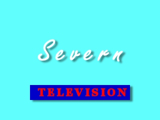
...whereupon the new company's name faded
up in the middle of the screen, followed by the (possibly
unnecessary - after all, if it wasn't television, what the
IBA was it?) word 'Television" on the blue bar. The whole form-up was backed by three slow, ascending chords from a string section. Then spake an announcer: "Good morning. This is Severn Television, your new Independent Television service for Wales and The West." |
|
|
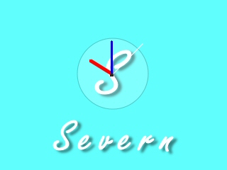
Viewers then got their first shufti at the station's rather neat clock. (This shot was taken later that morning, just before a Daffy Duck cartoon). |
| In fact, Severn's initial presentation was generally straightforward and rather understated, as witnessed by this early break caption during a showing of the comedy series Shelley... | 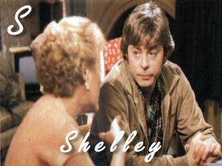
|
|
...and this production caption. |
| Of course, this was at the start of 1982, so Severn was still obliged to provide Welsh-language programming on its Welsh transmitters. No expense was spared (or rather, used) in re-jigging the main ident for use as a front-cap. It wasn't animated, though, and the company used the excuse that it would look really silly if the river suddenly started flowing upwards and then the trough just hung there... | 
|
|
It wasn't to be for long in any case, as S4C took over Welsh programming from November of that year, causing Severn to commit itself to the most basic of production slides for its occasional contributions to the new service. |
| In the initial months, Severn used the same idents for both its services, not even making any distinction prior to local news programming. This confirmed the worst fears of some that the station's agenda was, at root, dictated from Bristol and London. A few studio sit-ins and the odd trashed office later, the company decided that at least some recognition should be made of the dual nature of the region. This merely involved tacking a couple of seconds on to the end of the existing idents, in which the words "for Wales"... | 
|
|
...or "for the West" were wiped on to the bottom of the form-up. |
After four years or so, it was decided that the initial set of idents had long outlived their allotted span, so it was decided to produce something bolder and right-now.
| So it was that, just before Easter 1986, the beginning of the day's transmission made some people think that their T.V. set needed to go back to Rumbelows, and made others (of a more hysterical cast of mind) think that ITV had become a channel for governmental attempts at hypnotising them into acquiesence... | 
|

|
...especially when the swirl started to expand...."WE ARE CONTROLLING EVERYTHING YOU SEE AND HEAR...!"... |
| Erm... sorry... don't know what came over me there. We now had further unwinding, rather like milk in coffee... as long as you like your coffee blue, of course... | 
|
|
But then the spring was uncoiled to the limit, and all it was was the letter 'S' after all. Conspiracy theorists from Box to Bangor sighed with frustration at being thwarted yet again. |
| Then the station's name started to appear, as if on vertical blinds... | 
|
|
...to complete the picture. |
Ironically, the lone 'S' had been used by
the station on its break captions from the beginning, so
at least there was some semblence of continuity. The captions
were replaced at this point by a break bumper which consisted
of the ident running backwards from the 'S' to the beginning.
This was even more disturbing than the right way round...
The production caption was sufficiently unimaginative
as merely to add the word 'Production' at the bottom.
|
All of this came to an
end in 1989, of course, when the first set of generic ITV
Idents (henceforth known as "The David Dundas Music
Royalties Pension Fund") appeared.
To be fair, the 'S' looked quite striking in the inital frames... |
|
|
...and darkening the blue background so that it all-but matched that of the beginning of the generic worked well to make the station's symbol stand out more at the end. |
As one of the conditions for getting its licence renewed, Severn Television had to concede the need for more distinct identities for its two services. Rather than do anything too radical however, the company decided that a mere change of colour would be sufficient to mark the difference.
| So the Welsh ident would start with a background which was red (-ish)... | 
|
|
...upon which a silver-grey 'S', in a completely different style to the first twelve years of the station, would fade in... |
| ...followed by the station's name in the same colour. | 
|

|
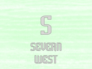
The West Of England would get theirs in green... |
| ...though apart from that... | 
|
|
...only the name was different. |
The authorities still weren't very happy with
this. It wasn't distinctiveness as they understood it. So
they nagged on at Severn to produce something a bit better,
much to the company's annoyance, having seen a perfectly
good set of idents junked to make way for the 1989 generics.
However, in the Autumn of 1994, a couple of
notable changes took place.
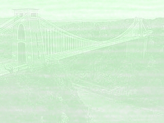
| Firstly, the background showed (if you looked hard enough) an appropriate landmark. For Wales it was the old Severn Bridge... | 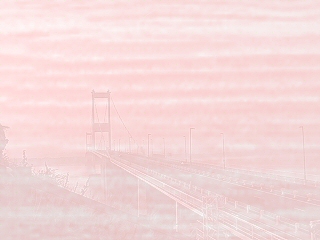
|
|
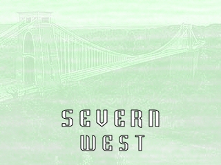
...and Clifton Suspension Bridge for the West. |
| The lettering was in a different place as well. Because of the different angle of shot of the bridges, "Severn Wales" appeared above the picture... | 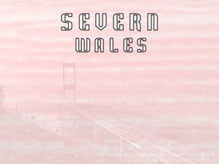
|
|
...and "Severn West" below. |
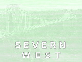
| This was all so-very-pastel, so-very-post-modern, so-very-....well, unreadable, really. Grey wasn't really 'doing it' any more. So the following year, Severn gave up on being trendy, and made the lettering white, but with a grey outline... | 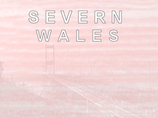
|
|
...whichever side of the estuary you were watching from. |
| After four years, it was time for another attempt to make all of ITV look the same. Gone once more was the distinction between Wales and West, and all Severn continuity was fronted by this generic... | 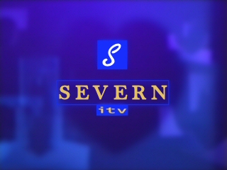
|
|
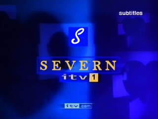
...slightly amended scarcely two years later, as if it made any difference. |