 The Judge RANTS!
Date: 05/06/07
Time For A Logotomy
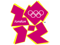
So this is to be the logo for the 2012 London Olympics:

Yes, that's right. £400 000 of our money handed over to an agency, and this is what they come up with.
Public reaction has been, to put it at its kindest, mixed. While there are some who think it is an insult, others take a different view, considering it to be an absolute fucking outrage.
They're all correct. I mean, look at the bloody thing! It's all jagged edges (perhaps to represent the bits of the new handy-dandy facilities which won't be finished in time), you can't see clearly what it's supposed to be (except, of course, a 'high concept'), and the colour schemes are enough to induce nausea in a four year old (if only because said four year old doesn't see why his design - done in crayon on the bit of cardboard his grandad's new shirt came with - was refused the commission).
Of course, those behind this mess are giving it everything in an attempt to bulldoze their lack of sense and taste through. Someone described by the BBC as 'a London 2012 spokesman' (although it turns out to be a spokeswoman) claimed, "Our emblem needs to be modern, bold, flexible...". I'm only surprised that she didn't call it "synergistically dynamic and diverse", seeing as she was in Marketing Bollocks mode. And Sebastian ('Lord') Coe, appointed as chief huckster for this Festival Of Shite, went so far as to say, "It's not a logo, it's a brand...".
Of course it is, Sebbie dear. It should be a brand. It would look good on the foreheads of whatever pretentious dorks designed and chose it.
Look at it again. Someone pointed out straight away that it looks like Lisa Simpson giving head. I'm not so sure. I think it's Tessa Jowell, Secretary of State at the DCMS (the Department of Craven Murdoch Servility), paying her favours to the wretch Blair for keeping her in a job light years beyond her competence for nearly a decade.
But, I suppose, it sums up Blairian Britain perfectly. The triumph of some bright-eyed young thing's idea of 'style' over meaning; the sneering in-your-face discordant glare; the idea that the new Great And The Good know best, with its arrogant 'complain as much as you like, you won't change our minds' attitude.
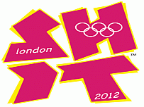
I prefer this, created by an anonymous correspondent to The Register:


 The Judge RANTS!


